For the majority of us who go grocery shopping, upon entering the store, our minds go into autopilot. When I go grocery shopping, however, I tend to post-rationalise my trip as I trawl the aisles and ask why I put something in the trolley. Yes I think to much. That said, I’m a designer and an ideas person who’s quest is to design packaging and displays that will have more appeal and result in more sales. To get better and better I need answers, to understand what influenced me to buy a particular product, which I did not and why. I examine how the brand, product, or marketing on the package most influenced my decision. Which was most influential, the verbal or visual communication?
So yesterday I had to buy a new razor kit, having learned from a previous shopping trip that replacement blades for my existing razor are no longer available. So I thought it would present an opportunity to document and share the findings. The idea is to decode my shopping journey and understand what impact the packaging design had on it.
I decided to go a supermarket to buy this item. I know the supermarket well. I know the layout, though I’ve not been in the personal care section of the store. On arrival, in the personal care section I want to locate the men’s grooming category. I know that I subconsciously, and that I actually do recall from visual memory, colours, shapes, brands associated with a category. That, over time I’ve built a mental picture of it’s visual language. In my case, it’s a language of greys, blacks, metallics, blister packs, cylinder shapes associated. All typically masculine.
After a few gondolas of walking, I see these masculine codes which match my mental picture, so I continue to approach. So far so good, but the mental picture wasn’t entirely accurate, in fact blues seem to feature dominantly. Nevertheless I’m here.

Tip: Shopper’s associate visual languages with retailer’s categories. A learned behaviour. So if you’ve got a designer proposing a concept that radically challenges these conventions, it’s colours, shapes etc… you ought to carry out some in-store testing to validate it’s effectiveness.
Now I believe I’m around 3m from the gondola at this point. I’m certain given the visual cues I’m in the right place. What’s not clear is which brands they have and what types of razors are there. So I have to walk closer.
Now less than a meter from the razor products I see the Gillette and Schick branding, and I then start to appraise the types on offer. I’m scanning in each product in less than a second looking at the design of the razors. The graphics on the front obscured my view of the product, when my simple need I just to see the razor head and it’s features. Because who want’s to rip their face apart, my need for safety.

Tip: Notice that the graphics overwhelm the presentation of the product. A lot of visual noise.To achieve more shelf presence, it would be a smart idea for a package design with a simple yet sophisticated look & feel, celebrating the razor inside. Furthermore, it is well known that men have little patience for shopping or finding things. As my wife will attest when I loose my keys.
Now the first product I take off the display is a Gillette product since it’s a brand I’ve bought before and I trust it. With product in hand I’m still perusing the other products and it looks as though they’re all more or less the same. Some even vibrate. Yet it has also just occurred to me that I want one that has some spare blades inside. I can’t see any indication on the front, so I take a look at the back. Problem is I can’t see through the back of the package! There’s a hole in the bottom, but I still can’t see anything. And it’s the same with all of the products on offer. Now I should say that I can read the Japanese Katakana and Hiragana, but I am not familiar with the Kanji yet, so benefit of the doubt might go to Gillette. However, ‘5+1’ doesn’t adequately inform me of anything and there’s no window in the back of the packaging. Cue….Is this the best a man can get?!

Tip: The packaging has to manage shopper’s expectations, by disclosing all the details! Additionally, how tactile is the packaging? How does it feel in your hand? Is weight an important cue for quality?
As a last ditch attempt I compare pricing because it just might be that the price might denote that there are some spare blades inside. But it’s hopeless, I’m buying blind, I have to take a chance and commit.
Sometime later..
I return home, I unpack it and learn that there are no spare blades included. I am disappointed and feel I didn’t get good value. A moment of truth for me and P&G!
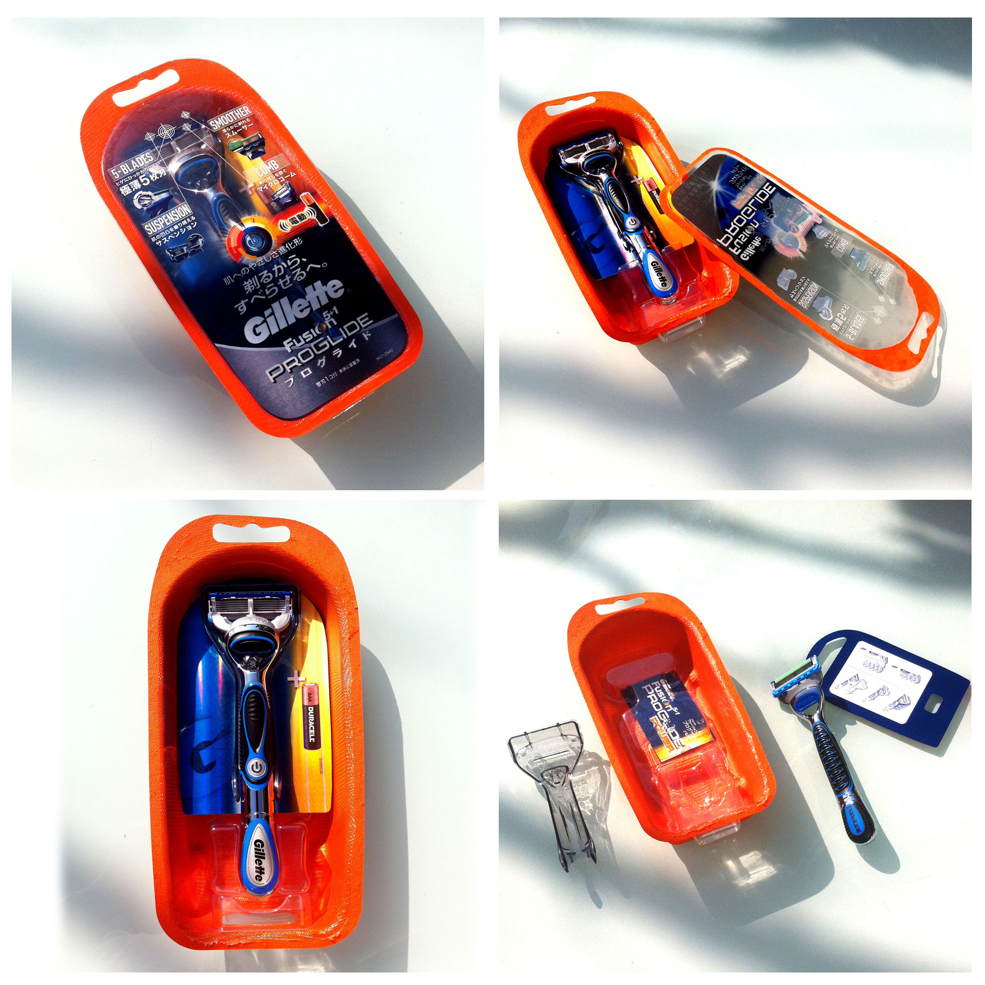
It’s not all bad. The razor worked superbly. I understand some parts of the packaging. For example, it’s use of the colour orange, it’s youthful cue which also helps to make the package standout from a display full of blues and blacks.
Now I should say that I know quite a bit about P&G and their design team. A team I have held in high regard for some time. Simply they have managed to do what other FMCG’s haven’t, which is to integrate ‘design thinking’ and designers into the fabric of their company. However, In my opinion and on this experience, the quality of thinking behind the design of their razor packaging is suboptimal. Could be a lot better.
How could this have been done better? I’m going to show you and propose a better design in my next post.
